
Bubble charts derived from Oct 1, 2018 Singapore REITs Fundamental Comparison Table. Two observations compared to last Bubble Charts.
(1) There are slight shifting of the Price/NAV to the left. This indicates some REITs are getting cheap based on valuation.
(2) There are no big changes in term of gearing.
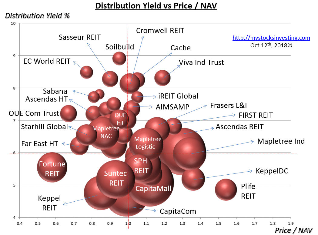

These Bubble Charts are used to show the “relative” position compare to other Singapore REITs.
Two visual bubble charts to pick and avoid:
- Undervalue Singapore REITs with High Distribution Yield** (Value Pick)
- Overvalue Singapore REITs with High Gearing Ratio (Risk Avoidance)
** Distribution Yield are lagging.
Compared to previous Singapore REIT Bubble Charts here.
Disclaimer: The analysis is for Author own use and NOT to be used as Buy / Sell recommendation. Get a proper training on “How to use this Singapore REIT Bubble Charts?” here.