
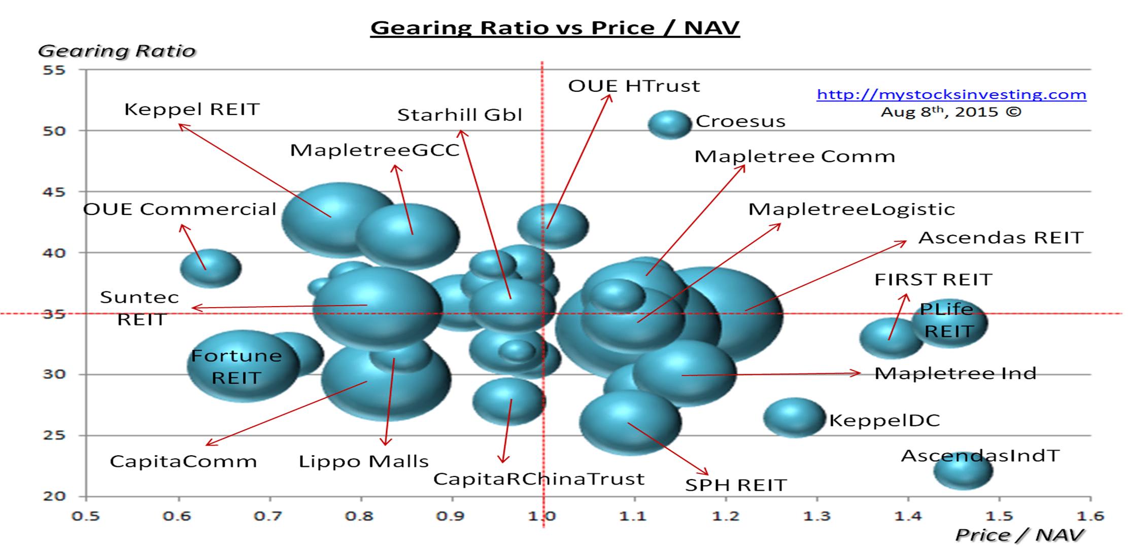
Bubble chart derived from Aug 2 Singapore REITs Fundamental Comparison Table.
These Bubble Charts are used to show the “relative” position compare to other Singapore REITs.
Two visual bubble charts to pick and avoid:
- Undervalue Singapore REITs with High Distribution Yield (Value Pick)
- Overvalue Singapore REITs with High Gearing Ratio (Risk Avoidance)
The Singapore REIT Bubble charts are best used to visually Short List Singapore REIT only.

Disclaimer: This is NOT a Buy or Sell Recommendation. Investors are advised to speak to the Authorized brokers for any investing decision. The Author does not guarantee the accuracy of the data and presentation.
See last Singapore REIT Bubble Charts here to see the relative movement.
To understand how to conduct Fundamental Analysis and Trend Analysis of Singapore REIT, check out the Singapore REIT Investing Class here.
