Singapore REIT Bubble Map (Market Cap, NAV & Distribution Yield) – June 2013 Post author:Marubozu Post published:June 1, 2013 Post category:Singapore REITS Post comments:0 Comments 
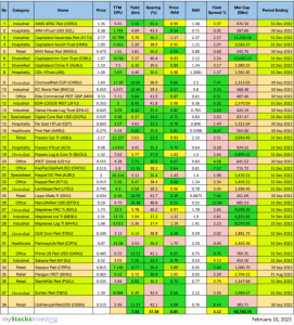
Singapore REIT bubble map derived from the comparison table for better visualisation. x-Axis: Price / NAV y-Axis: Distribution Yield % Size of Bubble: Market Capitalization Join the @REITirement Telegram Channel! You Might Also Like Singapore REIT Fundamental Analysis Comparison Table – 2 Sept 2018 September 2, 2018 Singapore REITs Comparison Table for Dividend Investment – July 2012 July 10, 2012 Singapore REIT Monthly Update (Mar 04 – 2021) March 4, 2021 Leave a Reply Cancel replyCommentEnter your name or username to comment Enter your email address to comment Enter your website URL (optional) Save my name, email, and website in this browser for the next time I comment. Currently you have JavaScript disabled. In order to post comments, please make sure JavaScript and Cookies are enabled, and reload the page. Click here for instructions on how to enable JavaScript in your browser.